In Good Company Postmortem - Art Edition
dotoriii's dev postmortem~!
Heya everyone! I'm here with my own art-focused edition of a dev postmortem for In Good Company. I had the absolute honor of working with Cynthia on this little story of ours. Cynthia did all of the planning, story, programming, and UI (as well as helped with some art direction).
To give some background on myself, this is my 2nd time participating in MFGJ (I also was the artist for my first MFGJ game, My Demon Date). I actually worked on 2 games as the artist this time around. First one being In Good Company, and the second one being Escape From H1-MA Station, a time/resource-management game with VN elements). I wanted to challenge myself with working on two teams (boy was it a CHALLENGE) and learned a lot of valuable lessons along the way which I'll talk about in this post-mortem!
---
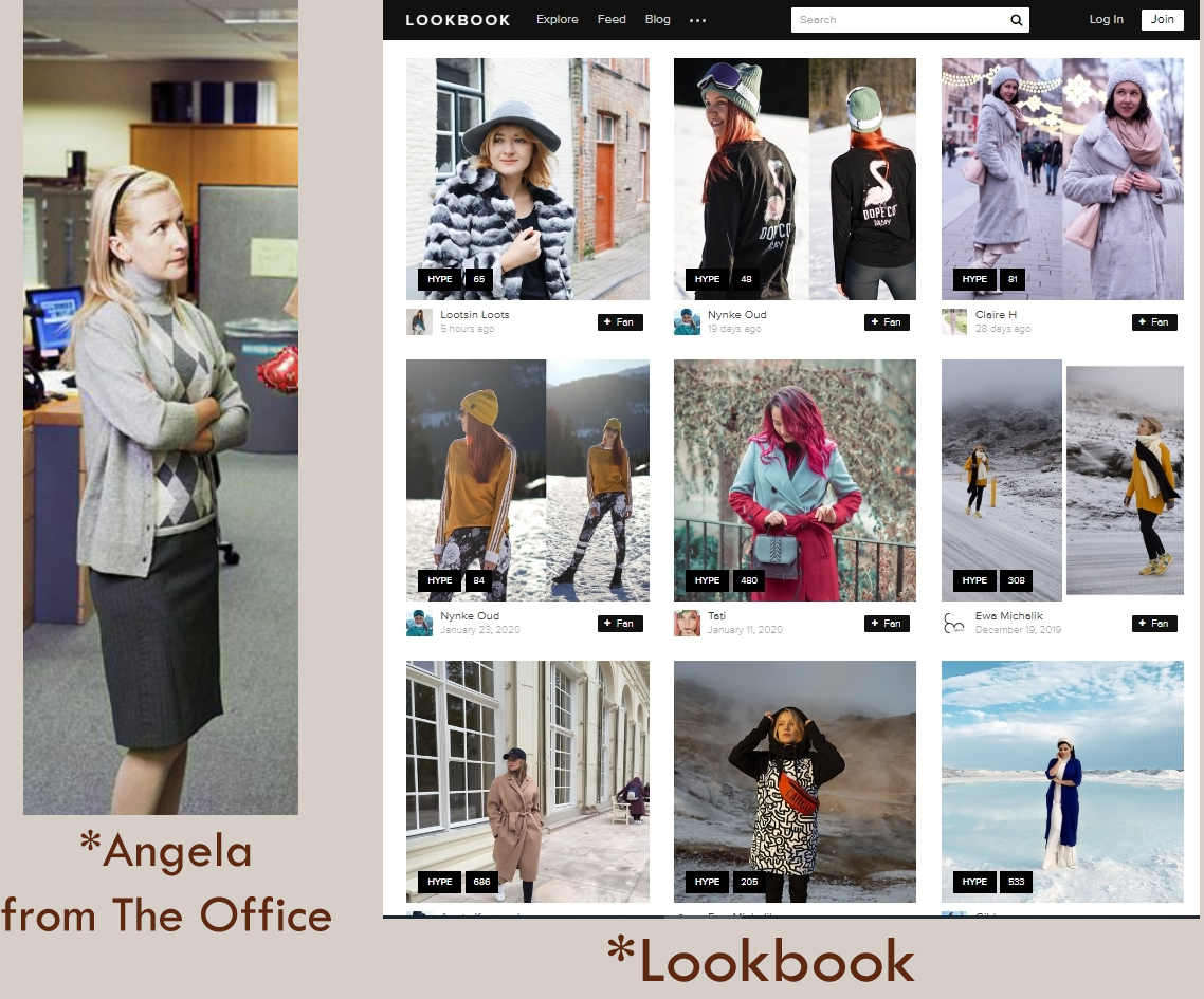
From the beginning we had a pretty clear idea of the overall aesthetic being cozy snow lodge/cabin. The clothing of each character would have to reflect that as well so to help with visualizing that Cynthia linked me to lookbook which provided great outfit ideas I absolutely referenced for most of the characters (using references is good!). We basically wanted 20-somethings in some winter semi-formal/business casual attire. Below is the first couple of brainstorming sketches I came up with to figure out how these characters would look. I figured it would be easier to just lay them all out like this instead of assigning names to faces yet just to keep our options open.
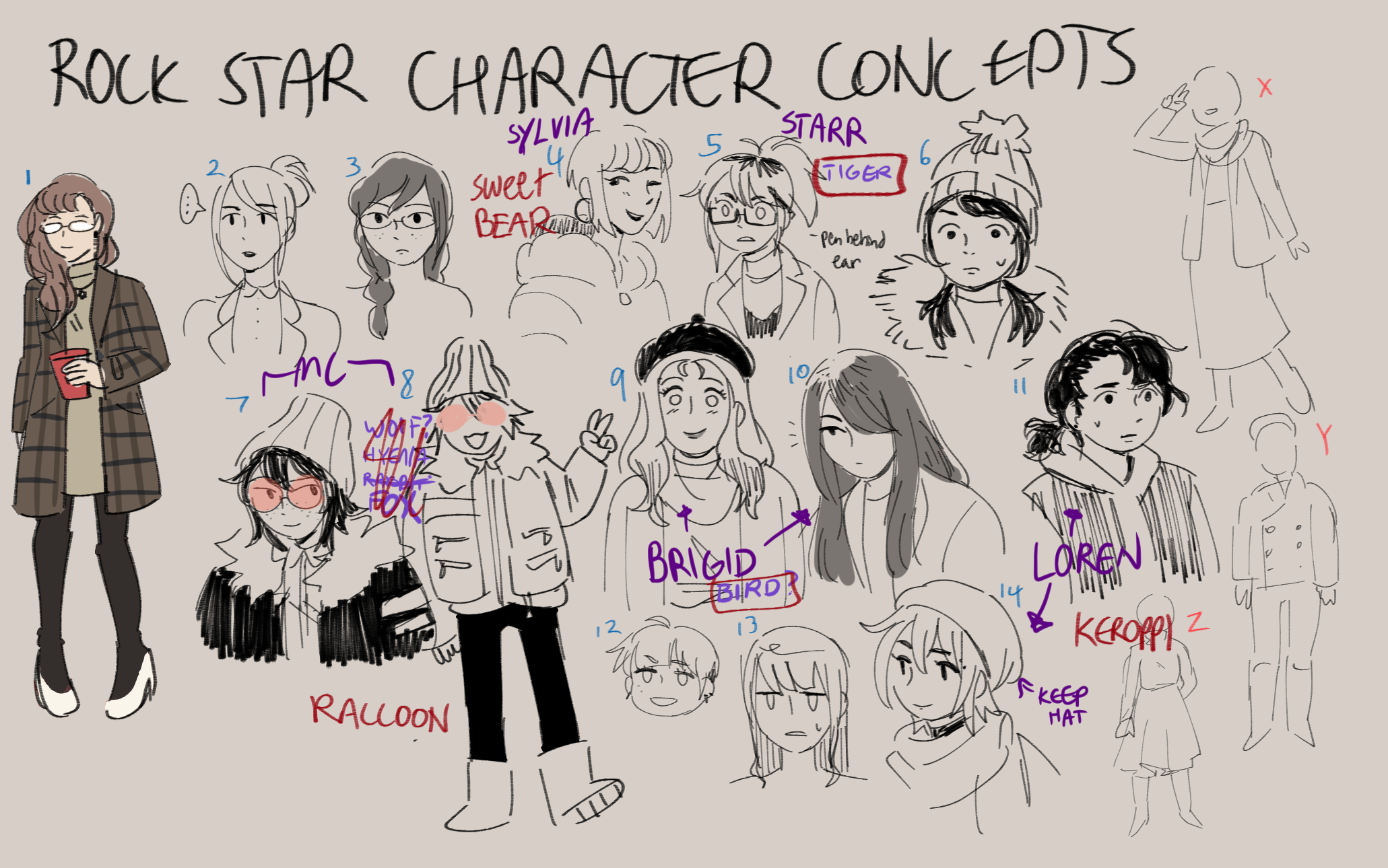
*The notes on this were written after I got Cynthia's feedback. Some faces were combined to make the final designs :>
After giving my first pass, Cynthia gave me some notes on which faces would fit our characters. Cynthia also had the great idea of giving everyone an overarching design theme of animals + a unifying color scheme! Admittedly I'm still learning how to work smarter with color theory so seeing Cynthia's color palette was an eye-opener. Especially since I was struggling a bit to figure out colors for the main cast in my other MFGJ game. You can read about how Cynthia's color palette inspired us in my post-mortem for Escape From H1-MA Station!
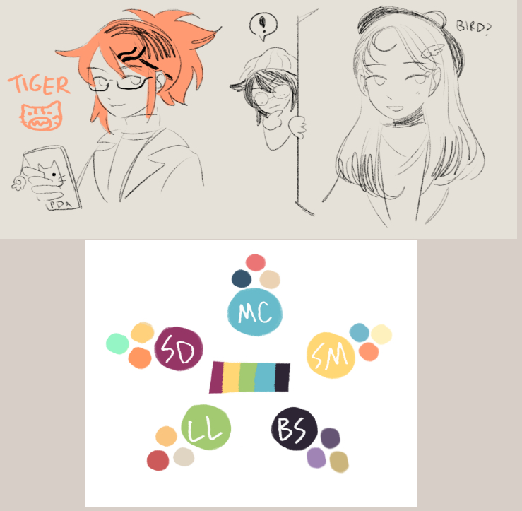
*These are Cynthia's sketches + color palette
Our character-design process was basically I work off of Cynthia's initial ideas + references, then I make some concept art to show her, then I reiterate on those ideas using Cynthia's feedback from the concept art. My biggest challenge for the designs other than color was probably conveying their animal themes in creative ways (and also not giving everyone a turtleneck sweater haha). Conveying each character's personality is usually difficult for me, but Cynthia's excellent writing provided a great foundation to work off of! I felt like we were able to bounce off of each other well in that regard (writing complementing the art complementing the writing).
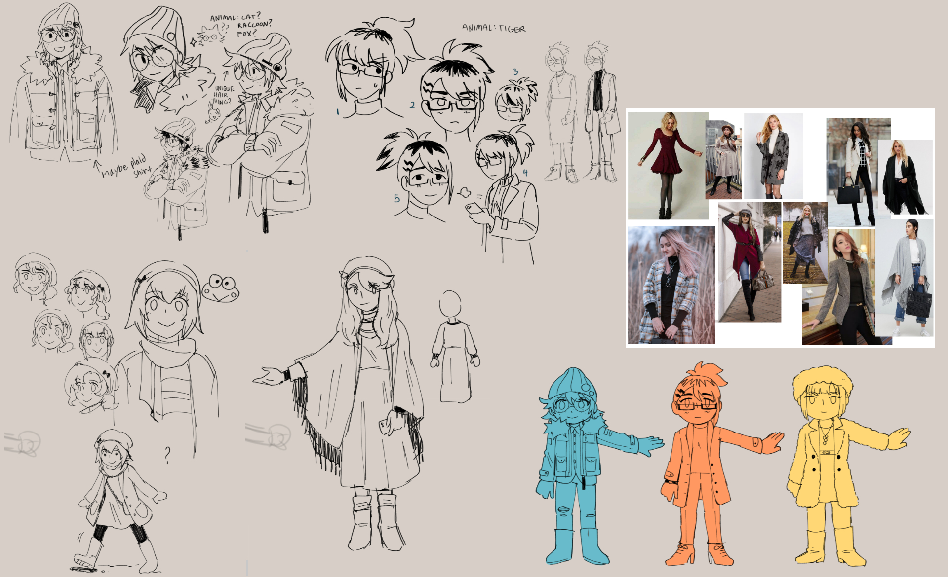
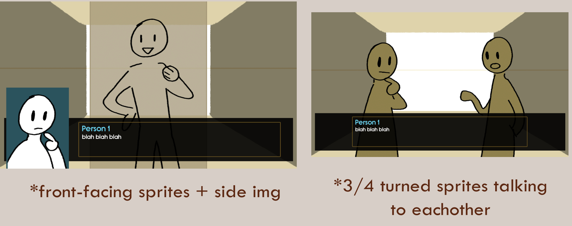
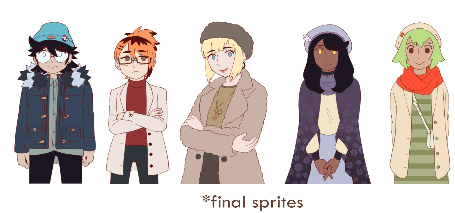
When it came to figuring out how the final sprites were gonna look, we decided front-facing would be the best choice (also Cynthia wanted to try something new, which would be implementing a side image for Rocky to express her emotions). It never really occurred to me until that moment that the orientation of sprites actually does matter a lot (obvious I know but it's something I never really thought about all that much). Cynthia had also provided excellent templates for both bgs and sprites and wow I highly recommend having templates for your own VN game if you're tasked with making consistent artwork. It really helps with keeping artwork relatively consistent without having to guess what parts will be visible above the textbox and such.
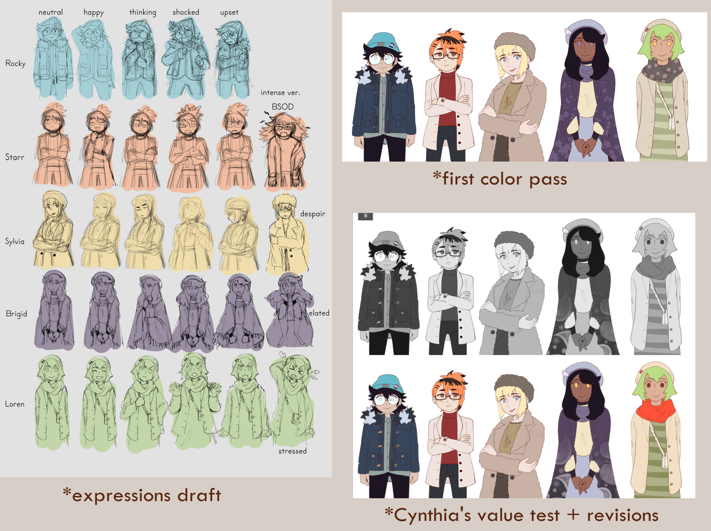
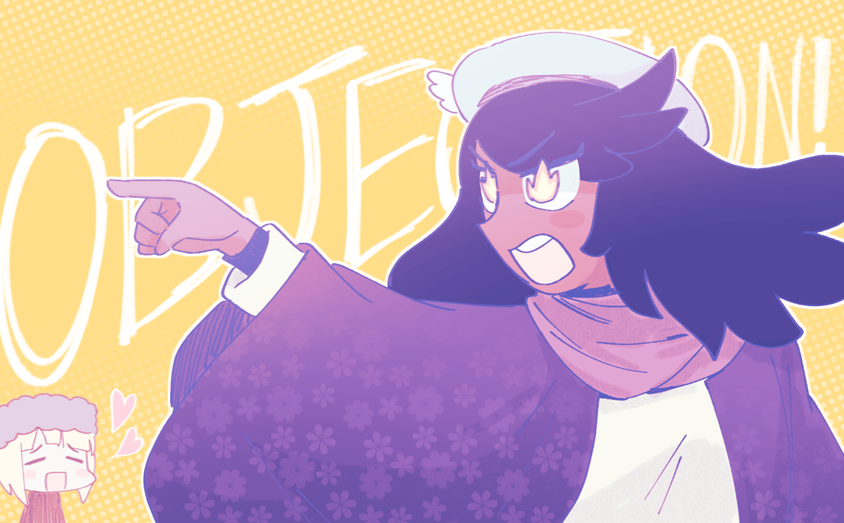
For the final expressions, I worked off of Cynthia's list of needed expressions + looked at other games with VN sprites for inspiration (Ace Attorney, Dangan Ronpa, etc..). I definitely channeled Ace Attorney breakdowns for the "Intense" expressions hehe.
As for colors, I kept fairly closely to Cynthia's initial color palette for everyone. Cynthia also gave me some really excellent feedback on the first color pass by explaining how she tests the readability of values and makes design tweaks based on that. Again, really eye-opening stuff for me who's been struggling with applying color theory :'D
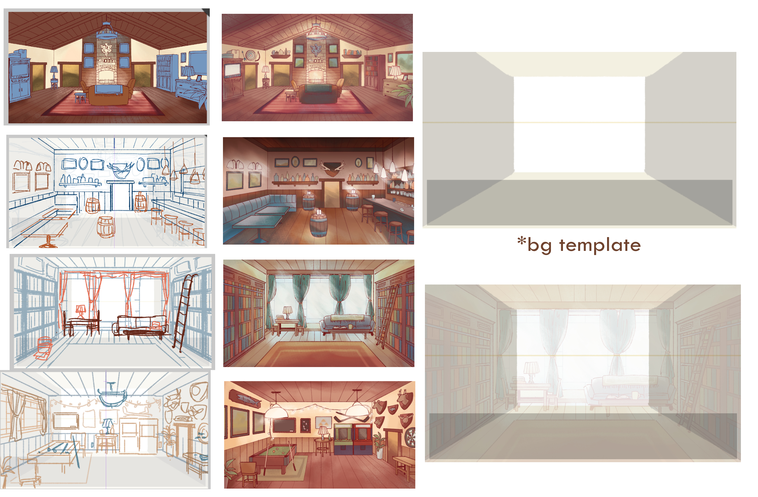
As for backgrounds, my biggest challenge with those was probably wrestling with perspective and prop placement. I am not an experienced bg artist by any means, but by doing just these I felt like I learned a lot! My main takeaways from doing these in such a short amount of time were: shamelessly utilize irl references, don't worry about perfection, and clip studio paint's perspective and symmetry rulers are valuable tools. I'm pretty sure most of the time working on this game was spent looking at photo references to work off of ahaha. But trust me, when you're stumped on figuring out how to design something just google some references and the ideas will come to you.
For example, I was struggling a bit with figuring out the composition for the library study bg, so I googled images of studys and found one with huge windows that I thought were pretty cool. So, I put them in my own bg!
---
To conclude, drawing art for 2 game jam teams was an absolute thrill and a huuge learning experience ahaha. I got to hone my own sense of art direction and learn some things about working with colors. I also learned a valuable lesson in time management (don't be a slacker! just do it!). Figuring out how to balance work for both teams was a bit of a struggle but I think it's safe to say it turned out alright in the end! I would definitely love to keep working on art for games in the future :>
Without Cynthia's strong vision and guidance I would've been totally lost for In Good Company. I couldn't have asked for a better teammate to work on a game like this with. Please check out Cynthia's own works on itch.io (especially her Danganronpa: Lapse series) and on twitter!!
Also check out Cynthia's dev post-mortem for the story/game design side!
Thanks so much for reading!! <3
Get In Good Company
In Good Company
Four associates are suddenly stopped in a snow lodge on their way to a celebration.
| Status | Released |
| Authors | mythridate, BUNPPANG |
| Genre | Visual Novel, Interactive Fiction |
| Tags | Casual, Female Protagonist, Lesbian, Ren'Py, Short |
| Languages | English |
| Accessibility | One button |
More posts
- IGC bug fix (ver. 1.1)Feb 14, 2020
- In Good Company - a MFGJ postmortemFeb 12, 2020
Leave a comment
Log in with itch.io to leave a comment.